CALICO THUNDER RIDES AGAIN - COVER REVEAL
- T. A. Hernandez

- Sep 18, 2019
- 4 min read
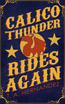
GUESS WHAT DAY IT IS, GUYS?! It's cover reveal day!!! I'm so, so excited. We're just 7 weeks away from the release of Calico Thunder Rides Again, but I've been sitting on this cover for months. I've only shared it with a handful of people until now, but it's finally time to show the whole world. Check it out.

Title: Calico Thunder Rides Again
Author: Me! (T. A. Hernandez)
Publication Date: November 5, 2019
Length: Approx. 60,000 words / 200 pages
Preorder now: Amazon
Calico Thunder Rides Again is the fantasy novel I've been working on for the past year. Set on a magical traveling circus in an alternate 1920s America, CTRA features a dragon (named Calico Thunder), a down-on-his-luck cowboy, some conniving mobsters, and magical Prohibition. If you want to find out more and read an excerpt, check out the CTRA page on my website here.
COVER EVOLUTION
Like the story itself, this cover went through several different iterations before I settled on the final design. I thought it would be fun to show you all what that process looked like.
I started by looking at fantasy covers on Amazon, specifically books about circuses or dragons. I quickly learned that if you're going to write a book with a dragon, you should probably put a dragon on the cover, so that's what I decided to do. I also looked at Pinterest for inspiration - anything to do with old circus photos and posters from the golden age of the circus. You can check out my Pinterest board here to see some of the inspirations behind the cover design for CTRA.
At first, I decided to go with a silhouette approach. This was back when CTRA was still a short story and my goal was to get it done and put it up for sale rather quickly, so I didn't want to spend a ton of time on it. I tried out different colors, text placement, etc. and ended up with these results:


I had my heart set on the blue/red/gold color scheme for a long time, but once I did the red/black/gold one, that was more the direction I was leaning. I wasn't totally satisfied with it, but it felt good enough for a quick short story I was just going to get publication-ready between longer projects.
I then ended up rewriting CTRA as a novella, and while it was out with beta readers, I went back to the drawing board with the cover. I decided I wanted a more illustrated look for the cover (consistent with some of those old vintage circus posters) and since I had a very clear idea of what I wanted this dragon to look like and didn't want anyone else to touch it, I opted to do the art myself. It was kind of a daunting prospect. I used to draw animals all the time as a kid, but I don't do that so much anymore. I wasn't even sure if it would turn out right, but I found some good references and got to work.
I knew it was going to be important to get the base shape and shading just right, especially with all the colors I was going to add on top, so I started out in black and white. I then blocked out the different colors on separate layers and used various adjustments to get them right. After that, it was just about blending everything together so it looked more seamless. You can see some of the stages the art went through below. (I eventually had to adjust the colors further on the final artwork so it wouldn't print too dark - the inside of her mouth especially.)


After that, it was just about placing the art on the cover and bringing the whole composition together. Again, I tried several different color and text placement variations. Below you can see just a few of the ones I saved. The blue circle was a last-minute change, but as soon as I saw it, it just brought everything else together. Here's a fun little design principle for you: it works because it provides some good color contrast for both the red of the rest of the cover and the orange of Calico Thunder's scales.


Once I settled on the colors, it was just a matter of adjusting fonts, adding some additional texture, getting feedback from a couple of artistic friends, and making further color/text adjustments based on their comments. And voila! I ended up with the cover you see above. Of course, then I had to go back in and design the paperback wrap-around cover and the hardcover dust jacket, which you can see below. I actually had a lot of fun with that, and I'm super happy with how it turned out.

What do you guys think? Do you love the cover for CTRA as much as I do? Did you enjoy seeing my cover creation process from start to finish? I might do more of these kinds of things in the future, so I'd love to hear your thoughts.


Comments